| HOME |
 |
 |
I'm old enough to remember when newspaper front pages were put together by newsmen who had no design training. They simply wanted to spotlight what they believed were the most interesting stories of the day. Their wasn't much rhyme or reason to their pages, heavy on type, light on illustrations. Then there came a time publishers decided these front page were too cluttered and ugly. Enter the designers. One result was a great reduction in the number of stories on page one. Find a front page from way back when and you might see 16 stories or more, most of them one or two paragraph items. The front page of the Rome (NY) Daily Sentinel from June 18, 1933, is typical. That eight-column headline across the top of the page refers to what has been called "the Kansas City Massacre." What old front pages had in common was timeliness. These pages were indeed ugly, but they were much more interesting and urgent than those produced A. D. (after designers). |
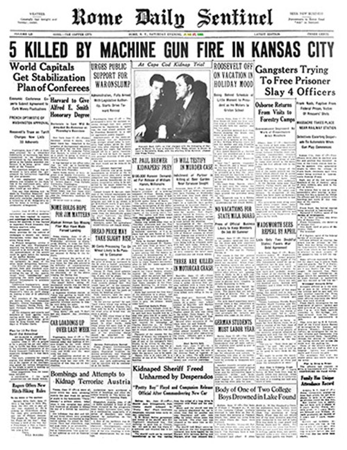 |
It wasn't long after designers took control of newspaper front pages that I knew print journalism was in trouble. The reason could be summed up in one word that was introduced by designers: "centerpiece." This referred to the dominant front page story, one often selected days before it was actually published. The "centerpiece" is well-illustrated and takes up a lot of space. Often it is about as interesting as an instruction manual and as timely as yesterday's weather forecast. Generally, they're written by an investigative reporter and they expose a situation that has existed for awhile. And while the situation may have significance, it's not very interesting and is not the kind of thing that jumps out at anyone who happens to see the newspaper at a newsstand. It would serve the reader just as well if it were published on page three. AS NEWSPAPERS devoted more page one space to photographs or other illustrations, the number of stories was greatly reduced. Some front pages these days have only two stories, few have more than four, and seldom do any demand your attention. Of course, a more important reason that newspapers went into a death spiral was the Internet. Most newspapers were slow to respond, but now there are electronic versions of newspapers, but these offer something even more chaotic than that 1933 front page (above). What you find on newspaper website home pages — which have unlimited space — is a dizzying array of headlines. Unfortunately, folks who tend newspaper websites don't know when to quit or how to organize. Often the same story is promoted three times or more on the same day. Sometimes you'll be greeted with an advance story on an event that took place two days ago. And if you wonder why some stories seem out of place on newspaper websites, it's because most of them are produced by people working hundreds, even thousands of miles from the city where the newspaper is located. Many newspaper websites use the same template. For example, you can spot the newspapers aligned with USA Today Inc. by the same website design that forces readers to use a magnifying glass when they look for something to read. This also explains why a reader in Rhode Island may be offered a story about something that is only of interest in Illinois. INTERESTINGLY, The New York Times, which for decades was one of the uglier newspapers, has one of the more attractive, readable websites, though, like almost every media website, its home page tends to go on and on and the same story may be mentioned several times as you go further and further down the page. Perhaps the biggest difference between a print version of a newspaper and its electronic version, is how the latter features some stories for several days. (I look at several newspaper websites every day, and there's one that kept the story of Jimmy Buffet's death on its home page for at least three months.) It's common to scroll a newspaper website and find stories about what stores are open on a holiday that was celebrated yesterday or the day before, or stories about how to watch a sporting event that took place yesterday. HEADLINES that begin "Where to watch" or "How to watch" ought to be lumped together away from actual news. A tiresome trend these day are newspaper "takeaways" from every kind of event imaginable, even when there's only one valid takeaway: It was a waste of time. Other wastes of time are lists of the 50 best films of the 21st century (so far) or the 100 best television series of all time or the 30 greatest living composers (which the New York Times did, omitting Billy Joel in the process). Today, at the top of the home pace on what I consider my hometown newspaper website (syracuse.com) this was the first headline that appeared under the heading, "Latest":
Previously, under "Latest," I've seen such things as:
Not exactly what you'd expect — or want — when you go looking for news, yet typical of what you find when you look news on newspaper websites. So Donald Trump isn't completely wrong about fake news. There is a lot of it out there, though his definition of fake news and mine are hardly the same. |
|
| HOME | CONTACT |